view case


Honeybee Benefits was a digital benefits platform for small and mid-sized Canadian businesses, created by Benecaid, a Toronto benefits provider with more than 20 years in the industry. Employers could combine insurance, health spending accounts and flexible Allowance Accounts for things like fitness, transit and pet care, and employees managed all of it from an app. In late 2018, about a year after launch, Honeybee brought in Crowdlinker to sharpen its positioning and rebuild its website around one clear offer. Two years later, Honeybee was acquired by Green Shield Canada.
Start-up
Insurance and Employee Benefits
Discovery, Product Marketing, UX/UI Design, Marketing Website
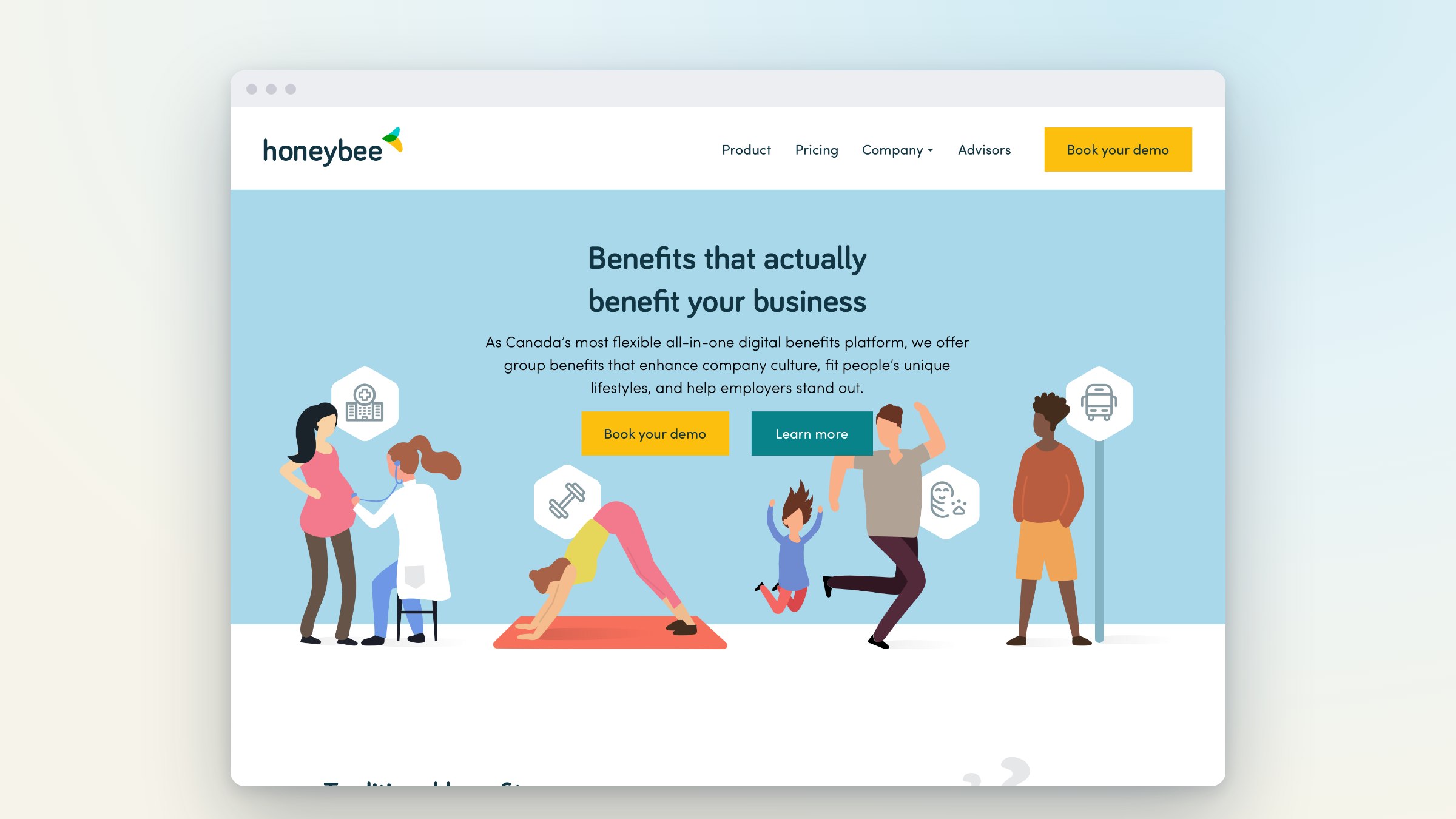

Honeybee had a strong product and a distribution problem. Group benefits in Canada are sold mostly through advisors and brokers, and Honeybee's first website was written with them in mind. Employers, the people who choose a benefits plan, landed on a site that assumed they already knew the vocabulary. Honeybee wanted to reach those employers directly and generate its own demand, without undercutting the advisors it worked with. There was also a deadline: a new version of the product was shipping in early 2019, and the website had to be ready to carry it.
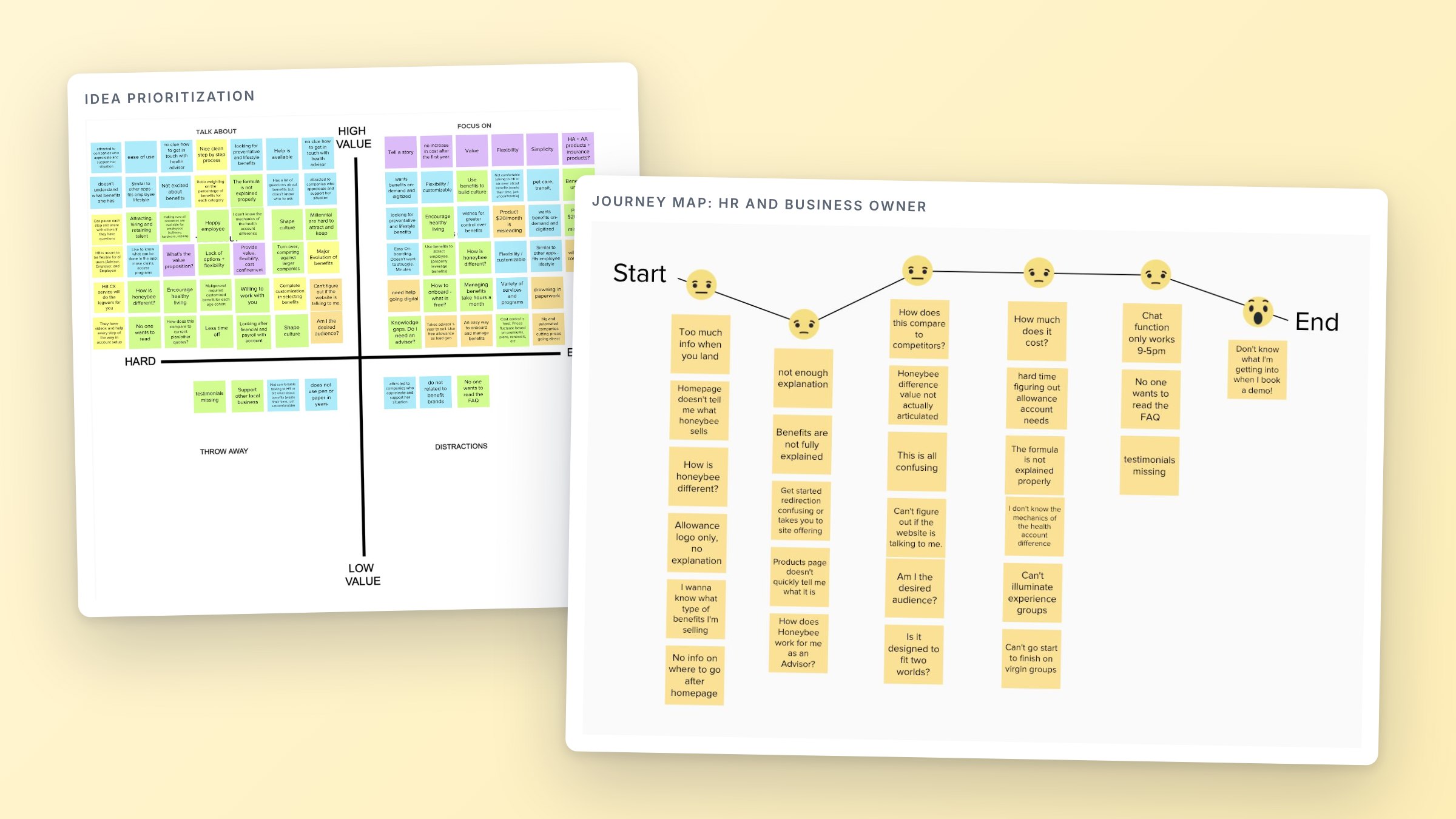
The message was trying to do three jobs. One site spoke to advisors, business owners and employees at once, and none of them got a clear answer to a simple question: what is this, and why should I care? Terms like HSA and Allowance Account went unexplained. The main call to action led into a multi-page questionnaire that asked for company details before a visitor understood the value, and many visitors left there.
The site was also hard to change. It was hand-coded static HTML, kept up part-time by a developer from the product team, with no designer and no simple way to publish content. Marketing wanted to own lead generation through search and content, and the site could not support that.
We started with a discovery phase run from three points of view: product marketing, product management and product design. We interviewed Honeybee's sales team to map where prospects got stuck, audited site traffic, reviewed competitors, and read the existing site the way a first-time visitor would. The findings went to the Honeybee team as a written report in January 2019.
Three personas came out of that work: the advisor, the HR lead or business owner, and the employee. We mapped what each one thinks and feels between a first visit and a booked demo, then sorted every idea by value and effort. The decision that followed was easy to state and hard to commit to: lead with one product for one buyer. The free Allowance Account became the front door, the employer became the primary reader, and booking a demo became the single call to action. Advisors got a page of their own.
A new sitemap and a page-by-page content plan came next, followed by six weekly design sprints with development running one sprint behind. We designed the pages and user flows and built the site on WordPress, working alongside Honeybee's creative agency, which led copy and illustration. Demo requests went straight into the team's existing Pardot and Salesforce setup, so sales saw every lead.
The new site went live in the first quarter of 2019, about three months after kickoff. The positioning did not stay on the website. Honeybee carried it into sales enablement material, training, scripts and collateral.
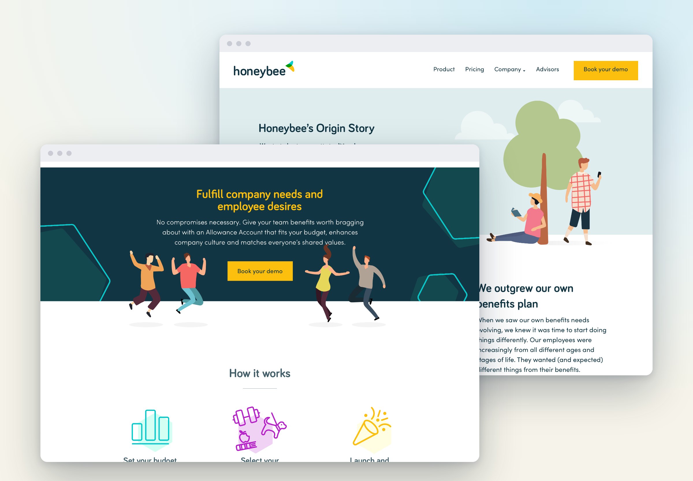
Honeybee went to market with one message and a site built to bring employers to a demo. In an interview for our 2024 video case study, Jason Dea, who led product and marketing for Honeybee, described what followed: the platform grew from its first dozen or so customers to several thousand people under management, helped by the refined messaging and a more polished web presence.
The work continued after launch. Crowdlinker went on to run search and paid campaigns for Honeybee and Benecaid, built a French version of the site, and supported the team on its React Native mobile app.
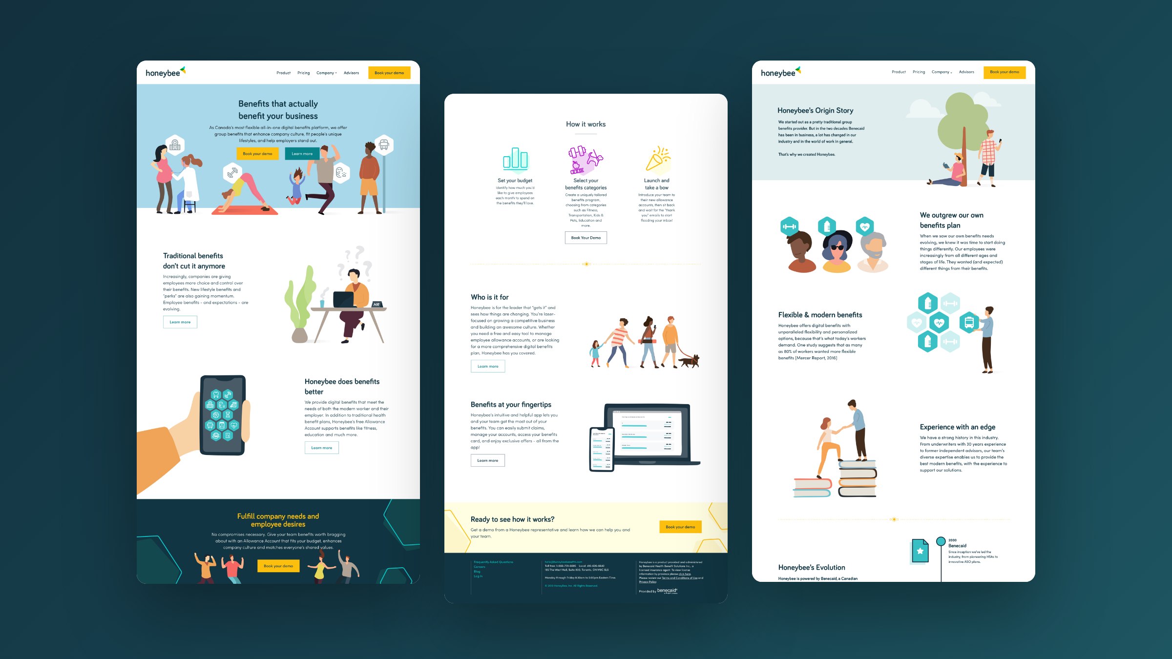
About two years after the relaunch, Green Shield Canada acquired Benecaid, and Honeybee with it. The acquisition announcement in November 2020 pointed to the Honeybee digital platform as part of Benecaid's record of growth and innovation. The positioning and website we built with the Honeybee team helped drive the growth that made the platform worth acquiring. In Jason's words, that growth was kicked off, or at least supported, by the work with Crowdlinker. Honeybee came to us needing a clearer story. It left with a product the market understood, and a buyer.
News & Media